From “Learning how to Learn from Masters: Module 4. Facing the blank canvas”
Here are the questions I’ve received from you over the last couple of weeks. I believed I have responded to everyone personally, but I thought these answers might be helpful and relevant to other participants, too (if I’ve missed your question, please accept my apologies and write to me again!).
Do I need all the colours suggested on your list of supplies? Do I need other colours, or am I supposed to mix them?
All you really need are two yellows (warm and more cold, lemon-y), two reds (one really warm red, and a cold one, closer to magenta), and two blues (French Ultramarine and a “green shade” blue), and Titanium White. You can mix anything from this combination. This restricted palette is particularly useful and helpful for beginners — and if you are not a beginner, you can just use your usual palette).
What is a complementary colour, and how to mix it?
Two colours are complementary if they produce black (or dark neutral grey) when mixed together (we often need a complementary colour to “mute” a pigment, make it less intense, less “brilliant” — but without changing its hue).
As a first approximation, the complement of red is green, the complement of blue is orange, the complement of yellow is violet. But there are different shades and variations of all these colours, and it is often important to find the exact complement.
Here is how you do it. I will use “red” for this example, but you can adjust it to other pigments. So, let us say you have a red pigment, and you want to mix it complement.
- Mix a green from blue and yellow (or take a green pigment if you have one).
- Take equal amounts of this green and your red, and mix them together.
- Is the mixture black (or dark grey), or does it have a visible colour? (If it’s too dark for you to see, add some white to the mixture). If it’s black, then you’ve found the exact complement to your red. If not, go to step 4.
- What is this colour “added” to the black? If your black/grey seems greenish, add a bit more red. If it’s reddish, add a bit more of your green mixture, and check again. Return to step 3.
- If your black/grey looks bluish or yellowish, you’ll have to adjust your green mixture, by adding the opposite colour: yellow if it’s bluish, blue if it’s yellowish. With this new mixture, return to step 2 (you will now need more of your original red to mix your black).
Repeat the steps as needed… Looking for complementaries is very useful for developing the sense of colour.
You say that value studies and colour sketches (Module 2) should be small. But how small?
The smaller dimension can be anywhere from 4” to 8” (or 10 to 20 cm), whatever size you are more comfortable with. The idea is the sketch should be small enough not to tempt you to go into too much detail, and not to make you introduce “accidental” tonal and colour variations. On the other hand, it should not constrain your hand movements too much either.
How do I choose colours to block-in the major colour areas of my final study?
This depends on the painting you are studying, and on your own preferences.
- The simplest strategy is to try and match the dominant colour of the area as you see it (and then make adjustments and further colour variations, as needed). This makes further work easier, since you have an approximately right “context” for each area right from the start.
- You can also start with colour

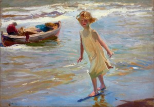
Joaquin Sorolla. Niña en la Playa. 1910 s (roughly) complementary to what you see, trying to match only the tonal values of major areas. This might be a better strategy if the colours you see in the painting are somewhat muted (and realistic), and if the undertones of complementary colours are visible in the painting. For example, I would start with a warm layer if I were to study Sorolla’s “Niña en la Playa”. This might also be a good approach if you are studying Cézanne, but don’t feel confident enough to follow his method.
- In case of some complex light/colour effects (of which Turner is the prime example), it might be necessary to start with a very muted, greyish layer (which can be either different or similar to the “final” colours). It’s usually impossible to see this underlying layer in the painting (at least if you zoom in), but if you are uncertain, write to me for suggestions.
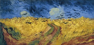
You say that Van Gogh didn’t paint his wheat field as a horizontal, but it looks horizontal to me.

It looks horizontal only insofar as we rely on our knowledge that fields ought to be horizontal. But this plane is painted (and seen by Van Gogh) as nearly parallel to the picture plane, as though the whole visible space were right in front of the viewer’s eyes. For example, yellows don’t lose their intensity towards the horizon (as they would if the plane was painted horizontal), there are almost no clues from linear perspective (the paths are nearly vertical); in short, there is virtually nothing in the painting itself to indicate that the field is horizontal. And this “collapse” of space, as though the horizon is rushing towards the viewer, is an essential part of the painting’s power.

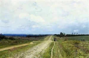
If you find it difficult to see what I mean, try looking at the painting “upside down”, or compare it with a realistic landscape like Isaak Levitan’s “The Vladimir road” (that’s the road Russian convicts had to walk in the nineteenth, with chains on their feet, on their way to labor camps). So (in contrast to Van Gogh), Levitan wanted his pictorial space to look as infinite as possible.
Is the purpose of this study to try to apply & learn techniques used by the artist?
Ultimately, the purpose of this study if what you intend it to be. We can learn much, much more from such a study than the master’s specific painting technique, although studying the technique can certainly be part of it.
In fact, I believe the role of “formal technique” in painting has been grossly exaggerated over the last century… It is, I think, no less important to learn how to compose a painting (not only how to “implement” it). Having said that, these two aspects are often hard (if not impossible) to keep apart in painting. For example, some colour effects depend very strongly on how the paint is applied (and we have many such paintings in the program). In such cases, studying the technique, or at least some aspects of it, is an essential part of this study.