From “Learning how to Learn from Masters: Module 3.3. Color in-depth”
In its essence, colour is light, and different colors correspond to different lengths of lightwaves. But it is important to understand that the colours of your pigments (just like the colour of any “corporeal” object) corresponds to the lightwaves it does not absorb. When we mix pigments, the resulting mixture can absorb more lightwaves, so it has “less” color; in mixing, the colors are as it were subtracted from one another (not “added” to one another). When lightwaves corresponding to all the colors of rainbow are mixed, it gives white; but when a similar range of pigments are mixed, it gives black (that is, no colour at all: all lightwaves are absorbed).
There are two (interrelated) consequences of this subtractive quality, which — if you don’t feel them — may make your colour mixing attempts a nightmare. The first is this: color loses its intensity (its “brilliance”) in mixing: your mixed colors will be less intense, more muted (or “muddier”) than the colors you start with. Different pigments have different “intrinsic” intensity, and hence different “mixing” properties, but this is true for all of them. Secondly, adding black and white to your pigments doesn’t just change the value of the colour (that is, doesn’t “just” make it darker or lighter); it also changes the hue (sometimes rather dramatically).
These properties of pigments cannot be learned theoretically (that is to say, such theoretical knowledge will be of limited help in the process of painting). It’s much better to feel your way into how your pigments mix. Hence, this series of “colour chart” exercises — I will just give some examples, but please modify the colors according to the specific needs of your future painting. These exercises will be useful if you don’t feel confident with mixing colors, or if the colour harmony of the masterpiece you are studying is very different from how you usually paint yourself.
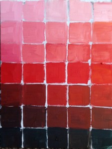
Shades of red
 Pigments needed: your most neutral red pigment, your “cold red” pigment (Alizarin Crimson, or Permanent Rose), orange (if you have it in your palette) or a warm yellow, Titanium White, and, finally the colour complimentary to your neutral red.
(Colors are complimentary is they give black when mixed; for a red, it will be some version of green. If you don’t have an appropriate green on your palette, mix a large quantity of it from blue and yellow).
- Draw a grid with seven rows and five columns.
- Paint the central square with your pure red (in my example, it’s Cadmium Red Light).
- Create a mixture (“Light Red 1”) which consists of your pure red and a bit of orange (or yellow, if you are using yellow) — there result should still be definitely “red”, just a bit lighter and warmer. Paint the rightmost square of the central row with this mixture.
- Create a mixture of your pure red and your “Light Red 1” mixture, approximately half-and-half (“Light Red 2”). Paint the square between your Red and your Light Red 1 with this mixture.
- In a similar way, create “Dark Red 1” by adding a bit of your cold red, and then “Dark Red 2” (in my example, I am adding some Permanent Rose to my Cad Red Light).
- Complete the central row by painting its leftmost square with Dark Red 1, and the next one, with Dark Red 2. Now you have a row of five variants of red.
- Separate each of your five mixtures into two parts (you will be using one of each for the top part of the chart, the other for the lower part).
- Add a small bit of Titanium White to each of your reds, and paint the row just above the central one.
- Add more white, and paint the next row. Continue till you fill the top row with very light pinks.
- To paint the lower part of the chart, add increasing amounts of the complimentary colour to your five reds (the central square of the bottom row should be closest to pure black).
Finding the right colour
Pigments needed: three primary colors (red, blue, yellow), white, black.
The previous exercise started with the colour of a certain pigment (in our example, red). This one is intended to figure out the “constituents” of a colour you see in the masterpiece you are studying, but don’t quite know how to re-create (this will usually be some kind of a “muted” colour: a shade of grey, an “earth” colour, or a flesh tone). It is, in effect, a “record” of your attempts to mix the right colour on your palette; it gives you a basic structure to explore various possibilities.
 In a sense, all colors “consist” of primaries — red, blue, yellow. So, to begin with, start with mixing these three pigments together to get as close to the colour you are trying to recreate as possible. In my case, I wanted to explore Rembrandt’s range of warm brownish colors, so I started with mixing red and yellow, and then adding a bit of blue.
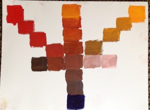
Paint three squares (or circles, the shape doesn’t matter) of your three primary colors at three vertices of an imaginary triangle, and a circle of your first mixture somewhere in the middle. Since I was interested in warm colours, I put my mixture closer to blue — I needed more space for “warmer” gradations.
“Link” your mixture to the three primary colors, by mixing it with more of each primary color. by For example, to link it to a yellow, mix in increasing amounts of yellow, and paint “intermediate” mixtures, one by one, till you “reach” the yellow (as shown in the example).
The middle row is created by adding bits of white and black, to explore lighter and darker variations of the “central” color.
This basic structure gives you space to explore further variations: for example, I also explore how my mixture changes by adding a bit more of both red and yellow at the same time (the upper part of the central column) — and this still leaves me space to try more nuanced variations.