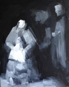
The tonal value of a colour area is its position on the dark-light scale (as opposed to its “hue”, that is, actual colour quality).
These two aspects of colour (hue and value) don’t exist independently: the black-to-white (dark-to-light) scale is closely associated with blue versus yellow opposition. On the other hand, we actually have two different neural systems in the eye responsible for perceiving hue (the wavelength of light) and darkness (the amount of light). The former one usually “works” in good lighting conditions, and the latter one takes charge when its dark. Both value and hue are extremely important in painting, but they are very hard to see at the same time. If a painting dazzles us with colour, an untrained eye (and often, even a trained eye) would usually be unable to perceive its tonal structure “correctly”. Yet the value structure plays an essential part in holding the whole composition together (and, quite often, in creating a realistic illusion of volume and space — but this is a topic for the next week).
 That’s why I would like you to make one or two monochrome sketches of the painting you are studying, using only black and white (if you don’t have a black pigment, make your own black by mixing blue, red, and yellow together). Since we are focusing on simplicity this week, we will start with only three or four tonal values (depending on the painting you are studying). It is quite likely that the painting process will introduce more variations in values into your sketch, but try to keep to the simple three or four value structure as much as possible.
For this study (or a series of studies), use canvas (or watercolor) paper of the same format as the painting you are studying (cut the paper if needed). It’s better to keep it small — its easier to avoid the temptation of introducing too much detail; and its far better to try it several times than to spend all your available time on one study. To start a sketch, use the knowledge you acquired from your “geometric studies” — the major value areas will be delineated by the major lines you have already explored!
Whether you want to use three-values or four-values sketch depends on the painting you are studying. Squint to see the painting’s tonal structure (squinting decreases the amount of light falling on your retina, and so “switches on” the system responsible for perception of values). What do you see? In some paintings, there will be a clearly perceptible “mid-tone”, opposed to darkest darks and “whitest whites” — if so, then it’s a three-value sketch. Other paintings rather fall into “dark area” and “light area”, with subtler variation within each one; if so, then try a four-value sketch (two “darks”, and two “lights”).
Please note that paintings can have different ranges of values: the “darkest dark” is not always “black”, it can be lighter, so you will need a dark shade of grey for your darkest tone. Similarly, the “lightest light” isn’t necessarily “white”. Begin with finding (and mixing, if necessary) these two opposites. Then, mix your mid-tone (or two mid-tones), comparing them to your “light tone” and “dark tone” (on your palette); if you use grey paper palette, you can also use this mid-tone grey as standard for comparison (it’s right in the middle between black and white).
If you are using opaque colors (oils or acrylics), start your sketch with painting the darkest areas (leaving the white of your paper to “stand for” the lightest light till the very last stage): you can always “correct” your sketch by covering black with white (the opposite wouldn’t always work). If you are using watercolors, it’s better to start with the light areas.
The illustration above is my own monochrome study of Rembrandt’s “The return of the prodigal son”. It’s a four-value sketch with some extra variations introduced in the process.
This post is a part of online program, “The Making of a Painting Masterpiece”.