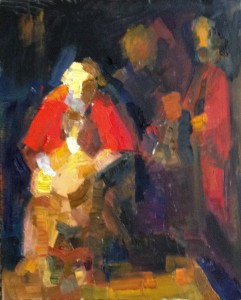
As in the previous study (or a series of studies) use canvas (or watercolor) paper of the same format as the painting you are studying (cut the paper if needed). It’s better to keep it small — its easier to avoid the temptation of introducing too much detail; and its far better to try it several times than to spend all your available time on one study. Don’t zoom in on any area of the painting — unless you absolutely cannot avoid it. Remember, our motto this week is simplicity!
 (The study of Rembrandt I am using to illustrate this assignment is 11.25”x9” — but I am studying a very large painting, two by two and a half meters (and I admit, I did zoom in once…) Your sketch can be at least twice smaller along both dimensions — but choose the size you are comfortable with.)
Do not look at your previous sketches — look only at the reproduction on your computer screen. This study does rely on all the knowledge of the masterpiece you have already acquired: its colour harmony, its abstract geometry, and its value structure. But let it rely on the knowledge that’s already inside you, not on what is visible in your sketches. More likely than not, you will capture the painting’s structure much better if you aren’t lead astray by your previous attempts (for that, it’s better to start this study on a new day, after a good night’s sleep let your brain absorb the information from the previous studies).
In a sense, we return to the “colour harmony” study of the first week, but with the painting’s own inner geometric structure instead of rectangular grid. Your goal is to find and reproduce the painting’s major colour areas — trying to match both the tonal values (which you’ve studied in the previous exercise) and the hues. If in doubt about tonal values, remember to squint! Do not try to reproduce the illusion of volume deliberately (we will come to that next week), but pay attention: shadowed and lit parts of the same object are often different colour areas.
If a major colour area has some inner complexity (that is, it is “built” from small “patches” of colors which work together to produce a unified impression), disregard this complexity for this study — try to mix a colour with approximately the same overall hue and value. However, if the inner simple geometry of “your” masterpiece is transparent, so that you have completed all the suggested practices for this week, and still have time to work on your study, do the following (optional) exercise).
Color modulation
Find a complex colour area — an area which seems unified within the overall context of the painting, but is “built” with small patches colour (whether they are created by small brushstrokes belonging to the same “layer” of colour, or by different layers interacting with one another).
Zoom in on this area, and try to see what colour “shines through” from the most visible layer of paint — it can be the white of the canvas, or there can be some underpainting, or “colored ground”.Cover a sheet of canvas paper with a very diluted layer paint of the “underlying colour” (if any). If you are not sure, try two or more options, and compare the resulting colour effects.
Now try to reproduce the colour effect adding small colour areas (or brushstrokes), one next to the other. Pay attention not only to the hues, but also to the relative tonal values of these smaller colour patches (more often than not, the impression of unity is created by tonal identity (or similarity) of seemingly different color patches).
This post is a part of online program, “The Making of a Painting Masterpiece”.