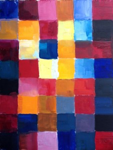
This color study is loosely based on a practice described by Johannes Itten in “The Art of Color”.
The intention is to find your color expression for the state of consciousness you have accessed during the first “deep looking” practice, without looking at the original (you will return to it in the next exercise). If you have found an anchor for the I-state (a tune, or a poem, or a word), please use it to re-access this state whenever needed (for example, if your mind begins to wander, or you get distracted). This practice helps you to access the “inner meanings” of colors, or, to put it the other way round, their expressive power.
Take a sheet of canvas paper, or watercolor paper, depending on your medium, and divide it into squares, approximately 7×7 grid (or more if you prefer, depending on the size of your paper: a square should be somewhere between 1″x1″ to 2″x2″ (2.5×2.5 cm to 5×5 cm). Each square will be filled with a certain color (without any unpainted areas in between).
You don’t need to be particularly meticulous about the boundaries between squares; the grid is there just so that you don’t worry about structure and composition, and can concentrate on color. One color can occur in multiple squares, if that’s how you feel. You don’t need to fill them in any particular order — just as your intuition guides you.
Your goal is to fill the grid with colors in a way that would feel to you like an expression of the I-state. Follow your intuition, and keep re-accessing the I-state. Don’t overthink it, and avoid relying on any “general”, “objective” psychological correlates of color you might have heard of, or any theoretical knowledge of color theory you may have. But don’t hasten the process either: ask yourself what the next color ought to be to keep the whole in harmony with the I-state, and “listen” for the answer. Once you have it, add the color to the grid immediately, without “analyzing” this solution in any way.
It’s better to complete this study in one painting session (it will take about an hour), but you can split it in two or more sessions if you need to. Just keep returning to the I-state, and asking it how it can express itself in color. Sometimes it helps to stand back, and look at your work from a distance.
If you struggle with this exercise, one option is to delay it till the next day — but recall this task just before you go to sleep, so that your brain and body can work on it while your consciousness is “away”. Some other ways to help the process: ask yourself what is the dominant color of the I-state? Which color is certainly absent? Are the colors you need brilliant and vibrant, or muted and grayish? Or both? Will there be any black? Any white?
 The original painting is bound to influence your work in some way, but it doesn’t need to have the same color harmony (this will be the goal of the next exercise). As an illustration, I am attaching my own color composition for the I-state I associate with Rembrandt’s “The return of the prodigal son” — you will notice that it is quite different from the original, even though there are visible similarities, too (this one is done on 9”x12” canvas paper).
This post is a part of online program, “The Making of a Painting Masterpiece”.