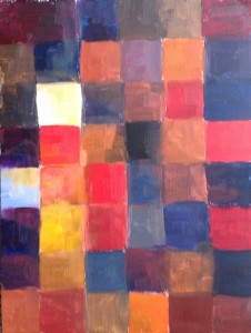
For this exercise, have the reproduction in front of you (place the computer in such a way that you can keep looking at the original while you are working).
Start with the same grid as in the previous study, but now your intention is to re-create the overall color harmony of the original painting, using the same dominant colors in approximately the same proportions, and allowing them to interact in similar ways. For example, if the original has both red and blue areas, but they are separated by another color, try to keep the corresponding parts of your study separate, too. This is because we cannot see colors in isolation: the neighboring color areas always influence one another (or rather: our perception of them).
Start filling your grid with the clearest, brightest most intense color spots you see in the original, then look for the darkest areas. The more “muted” a color, and the lighter it is, the more it is influenced by its context; that’s why you want to have a similar context “in place” by the time you are going to introduce such areas into your study.
 In this study, you will be mostly using “flat”, simple color areas — but don’t hesitate to add more variety within squares, especially at the later stages of your work. As an illustration, I include my own study of Rembrandt’s color harmony — you will see there are some flat squares, and some more complex ones.
Please pay attention to any color in the original which you find difficult to mix, where you don’t seem to know how to achieve exactly the same color. Note all these cases in your journal — we will return to them later on. For example, there is one such problem clearly visible in my Rembrandt study (and — luckily for the sake of illustration — it looks even worse in the photo than in “real life”): my darker areas reflect light, and therefore they can never be as dark as in the original (this is because Rembrandt layered thin glazes to create non-reflecting dark areas — something impossible to do in the framework in this exercise).
After you have completed this chart, please compare your two color studies — which do, in a sense, express similar “inner states”. Contemplate the differences and similarities: what do they tell you? Are they significant? Journal about it. These observations will be important later on, when you decide on the type of painting study you want to do.
[To continue with my example, the major contrast between my two color studies of Rembrandt has to do with the “dark versus blue” opposition: to oversimplify things, my “blue” stands for Rembrandt’s “dark”. I believe this difference originates not so much from my own, individual, color sensitivities; rather, it’s a sign of time, and the intervening history of painting. Oversimplifying again, my color sensitivity is a post-impressionist one. These are just preliminary observations – I am sure I will discover more later on… ]
This post is a part of online program, “The Making of a Painting Masterpiece”.