Why colour charts?
Colour-charting for self-reflection is one of my favourite painting practices. I picked it from Johannes Itten’s classics, “The Art of Color”, but modified and adjusted it over the years.
You might have encountered colour charts in the beginning of your painting studies. They are a common method of exploring material, objective aspects of colour: what happens when you mix two or three pigments, or how to achieve a certain shade or hue. But Itten describes how he and his students used a similar practice to explore what he calls “subjective colour”, to understand their own range of “colour timbres”. Numerous illustrations in the book show just how dramatically different our inner, subjective colour harmonies can be. Itten believed that this information about each individual student was essential in their further education.
I must admit that I have never used this practice to try and obtain knowledge about my subjective colour harmony “in general”, perhaps because I don’t quite believe in stable, permanent “self”. I feel like my colour range is flexible and fluid, more like a moment-to-moment flow than a stable palette. It may well be that I am wrong — in fact Itten warns the reader that people whose vocation has to do with colour may be reluctant to explore their subjective range. I think I will gather my courage and do so one of these days.
But I’ve been using a similar practice for years to colour-chart my inner states, impressions, responses — to get in touch with them, to understand them better.
I colour-chart Shakespeare sonnets when I cannot find a way to paint them, I colour-chart my inner responses to master paintings I study, and just to make sense of my thoughts and emotions.
For me, it is both a practice of self-knowledge, and an ongoing inquiry into the expressive power of colour, its inner meaning.
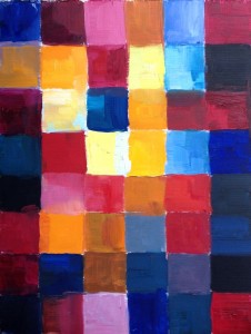
The idea is very simple — you make a grid with multiple squares, and then you fill this grid with colour. This helps you to explore colour without getting distracted by other aspects of painting, like drawing a composition. The grid creates a safe, structured space within which you can explore your inner state and how it can be expressed in colour.
The best thing about this practice is that you can start doing it even if you have no prior knowledge of painting whatsoever, but it grows with you — its potential is as infinite as the expressive potential of colour. And in the process, you learn more and more about yourself, and about colour and its inner power.
What you need to start colour-charting
I do my colour-charting with my usual paints — oil paints as it happens. This is because they are so flexible and easy to mix and play with, and — of course — because I have all the set-up ready and waiting for me.
But it can be done with any medium you can imagine, provided there is colour in it — other paints (acrylics, water-colour, tempera), coloured pencils, pastels, felt-tip pens; in short, anything you like to work (or play) with.
Which colours do you need on your palette (or in your pencil box)?
It is best not to limit your potential range of colours in advance, but it doesn’t mean you need an infinite range of ready-made colours. All you need to be able to “make” any possible colour is two reds (one warm, like Cadmium Red, one cold, like Alizarin Crimson or Permanent Rose), two yellows (Cadmium Yellow Medium or Deep, and Cadmium Lemon are good choices), and two blues (French Ultramarine for the “redder” option, and something in the greener range, like Prussian Blue or some Phthalo (green-shade) blue). If you are working with opaque colours (oils or acrylics), you will also need a white pigment.
If you have your familiar, favourite, established palette, there basically two routes to go if you decide to try colour-charting: use your palette, or take this practice as an opportunity to shake up your routine and explore other options (or additional constraints on your colour choices). Both options have their advantages and their drawbacks.
You will also need some paper, appropriate for your chosen medium. For oils and acrylics, canvas paper is the best choice. Otherwise, choose paper that feels good with your medium; and it’s better if it’s of archival quality — colour-charting is a long, contemplative practice, and you may want to save the result for future references.
As for the size — I usually do this on 12”x9” canvas paper, and I don’t think it’s a good idea to go much smaller than that (there just won’t be enough space for exploration). But it can be helpful to use a larger format (up to 20” (or 50 cm) one side, if you are feeling adventurous).
All in all, it’s better to have at least about 50 squares in your grid, each somewhere between 1”x1” and 2”x2” (or two to five cm). I usually use 8×6 grids on my 12”x9” paper, which makes my squares 1.5×1.5”.
You can use a ruler to draw the grid, but that’s not really necessary (especially you are using paints, rather than pencils). You don’t need to be particularly meticulous about the boundaries between squares — the grid is there just to free you from thinking about structure and composition, so you can concentrate on colour.
How to colour-chart your inner state
In this practice, you are searching for your colour expression of your inner state, so there is nothing to guide you except your intuition. You start by tuning in to this inner state, and you will probably need to re-access it again and again during the process.

When I colour-chart my response to a poem, it means recalling the poem, letting it recite itself in my mind. When I colour-chart my response to a master painting, I try and go back to the inner state achieved in the process of contemplative observation (but without looking at the painting itself, so I can focus on my response, rather the painting’s colour harmony). If the intention is to make sense of an emotion, or a memory, then this is what I need to recall to the realm of my consciousness again and again, while making every single colour choice.
There are no rules about which squares to fill first, but it’s better to start somewhere just off centre, to break the blankness of your grid right from the start.
Since you don’t have anything to look at “outside” of yourself, this process may feel random at times. But it is not — or, to be more precise, it shouldn’t be. Tune in to your inner state, and ask yourself what is the next step: what colour? Which square? Pay attention to the answer — however random it might seem at the moment — and when you see or hear it, just do it: fill the square (without attempting to analyse it). Then, look at what you already have, and ask yourself about the next step.
Just follow your intuition, and keep re-accessing the inner state you are colour-charting. The key is not to overthink it, and also to avoid relying on any “general”, “objective” psychological correlates of colour you might have heard of, or any theoretical knowledge of colour theory you may have. There should be no considerations like “there is sadness, so I need blue”, or “there is red, so I need to complement it with green”, or “there are too many yellow squares, I need something different now”. If this kind of self-talk emerges, just tune in to your intuition again. Don’t hasten the process: listen to your inner state at each step of the way.
It is better to complete one colour-chart study in one session (it may take about an hour for a fifty-squares grid), but you can split it in two or more sessions if you need to. Just keep returning to the inner state, and asking it how it wants to express itself in colour. Sometimes it helps to stand back, and look at your chart from a distance.
If you struggle with this practice, one option is to delay it till the next day — but recall it just before you go to sleep, so that your brain and body can work on it while your consciousness is “away” in the world of dreams.
This essay is a part of online program of painting study, The Making of a Painting Masterpiece.