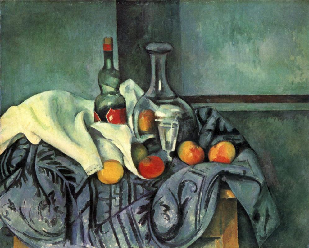
Colour harmony is the heart of painting — the most direct and open emotional pathway between the artist and the viewer.
Nowadays, it’s easy to find a “definition” of colour harmony — in books and on the internet — but, in my experience, they rather dim than clarify the essence of what this phrase is supposed to point to. So, instead of quoting one of these definitions (or inventing my own), I invite you to read this short extract from one of Rainer Maria Rilke’s “Letters on Cézanne” (he describes a conversation with his artist friend at Cézanne’s 1907 retrospective exhibition in the Grand Palais in Paris). In all my reading and studying, I have found nothing that comes closer to this essence (and I’ve taken the liberty to highlight the most important bits for you; the still life reproduction above is intended as an illustration for Rilke’s observations — please look at it as you read):
… gray, literally gray, cannot be found in Cézanne’s pictures. To his immensely painterly eye it didn’t hold up as a color: he went to the core of it and found that it was violet there or blue or reddish or green. He particularly likes to recognize violet (a color which has never been opened up so exhaustively and so variously) where we only expect and would be contented with gray; but he doesn’t relent and pulls out all the violet hues that had been tucked inside, as it were; the way certain evenings, autumn evenings especially, will address the graying facades directly as violet, and receive every possible shade for an answer, from a light floating lilac to the heavy violet of Finnish granite.
When I made this remark, that there is nothing actually gray in these pictures (in the landscapes, the presence of ocher and of unburnt and burnt earth colors is too palpable for gray to develop), Miss Vollmoeller pointed out to me how, standing among them, one feels a soft and mild gray emanating from them as an atmosphere, and we agreed that the inner equilibrium of Cézanne’s colors, which never stand out or obtrude, evokes this calm, almost velvetlike air which is surely not easily introduced into the hollow inhospitality of the Grand Palais. Although one of his idiosyncrasies is to use pure chrome yellow and burning lacquer red in his lemons and apples, he knows how to contain their loudness within the picture: cast into a listening blue, as if into an ear, it receives a silent response from within, so that no one outside needs to think himself addressed or accosted.
How is this inner equilibrium created from intensity and richness of colours?
A seemingly simple answer is to paint exactly what you see in nature, because there is nothing disharmonious in nature. And there is a lot of truth to this answer. But (apart from the fact that artists don’t always paint from nature) the deeper problem is hidden in this small word, see. Rilke implicitly evokes this problem when he talks about Cézanne’s “immensely painterly eye”, which goes to the “core” of every colour.
The question is, what is it we see when we look around us? Does one have to be born with this “immensely painterly eye”, which sees things that others miss?
Let me do something quite unusual at this point, and show you three early landscapes by three great masters of intense and rich colour harmonies: Paul Cézanne, Paul Gauguin, and Vincent Van Gogh. Here they are:
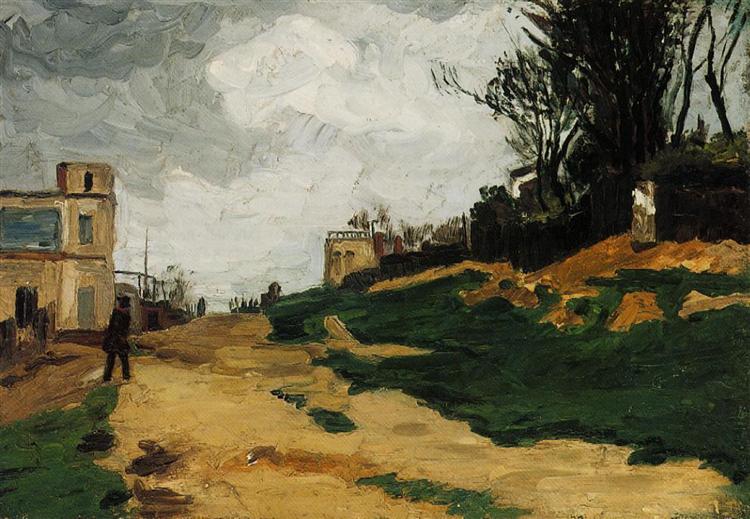
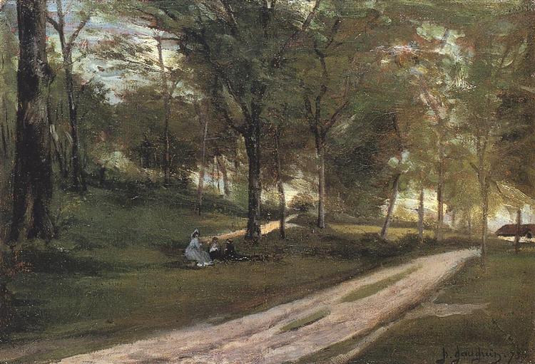
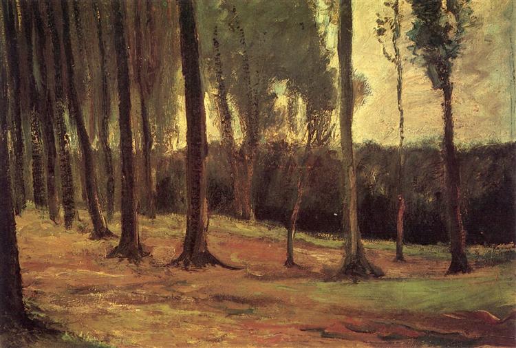
This is what they saw when they were beginning to paint — and, as you can see, it’s very different from what they saw at the peak of their mastery (just in case you want to refresh your memory of how their mature landscapes look like, scroll down this post — there are some illustrations down there).
Are you tempted to think that these early landscapes are more “realistic” than their mature paintings, that their later, intense colour harmonies are rather “expressive” than “realistic”?
I am quite certain this is not the case. It is not a matter of style, or “expressive use of colour”. It is an expansion and transformation of the sense of vision itself, and this expansion is the deepest (and most seductive) promise of painting.
The truth is, all our eyes receive an immensely richer visual input than we are normally aware of, because our brains are trained to “filter out” most of it, to dull it all down — so as to make it easier for us to recognise things and navigate our environment smoothly. The process of painting gradually switches off these filters, and awakens you to the rich intensity of visual reality. In my experience, it first happens within the space of painting process only; the filters are back “on” once you are back in “real life”. But later on, the new visual reality can begin to spill over into other realms of life, and your whole world changes.
And it is easier for us to find the path to this transformation than it was for Cézanne, Gauguin, and Van Gogh — because they were there, and can show us the way if we are willing to learn from them (they had help too, of course — from all the painters who came before them, but most significantly, from impressionists and from Eugene Delacroix). Rilke writes, in another letter, about his path of learning from Cézanne:
One can really see all of Cézanne’s pictures in two or three well-chosen examples <…>. But it takes a long, long time. When I remember the puzzlement and insecurity of one’s first confrontation with his work, along with his name, which was just as new. And then for a long time nothing, and suddenly one has the right eyes …
I believe there is a way to make this process more intense, and faster: it’s colour-charting great paintings — that is, making your own colour chart of the painting you want to learn from.
This is an essential preparatory practice for a full-scale painting study of a masterpiece, but it is also extremely useful as a “stand-alone” practice, which teaches you more about colour than any theory, and more than just looking — because it is learning by doing. Nothing can replace studying colour from life, but this practice really open your eyes to seeing more of it, more purely, more intensely. And like any colour-charting practice, it is works at any level of mastery (or lack thereof): if you are not a painter at all, it will throw you right into the peak experience of colour; if you are an accomplished painter, it shakes off your routine and opens new pathways to explore.
All you need is some paper, and some painting medium. I will show you my way of doing it in three examples, three of my own encounters with great masters of colour.
Gaugin’s reds
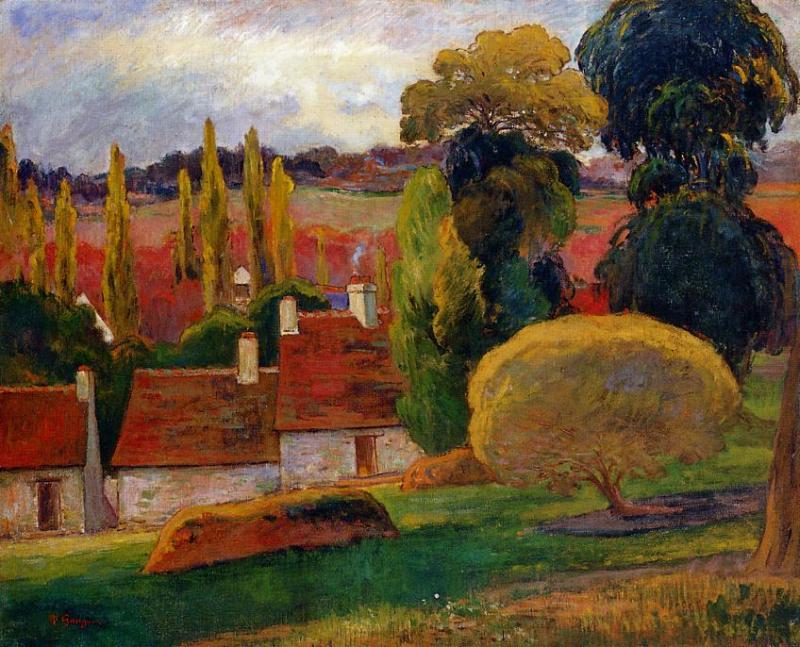
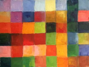
At the heart of this colour harmony is the stark contrast between two complementary colours, red and green — an extraordinarily difficult thing to pull off, especially when both opposing colours are so intense. This contrast, ever-present and invariably beautiful and harmonious in nature, often comes off as gaudy or dull in painting.
So how does Gauguin make it work? — this is the question behind this colour chart.
It is done on a small, 12″x9″ canvas paper, roughly divided into 6×8 grid. Since colours work in interaction with their neighbours, I use the grid as a small “scheme” of the painting, putting colour areas approximately at the same places where they are in the original (for example, the dark green vertical on the right corresponds to the tree in Gauguin’s landscape).
A colour chart can, of course, be larger or smaller. What is absolutely essential for this practice is to do it slowly and contemplatively, so as to “soak in” the colour harmony — it’s not something to be completed and done with as quickly as possible. For a colour chart of this size, you need to reserve at least an hour and a half.
Van Gogh’s yellows
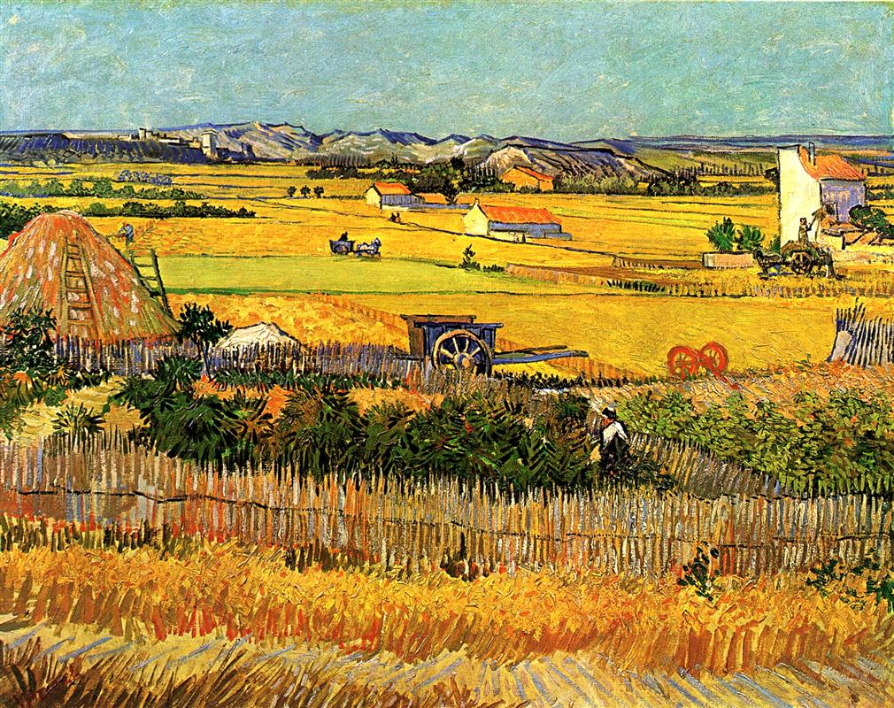
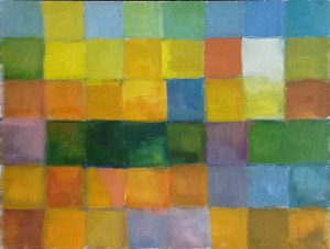
My colour chart of this painting is based not on the reproduction above (taken from Wiki Art), but on a higher-resolution (and very visibly different) Google Art Project reproduction (there, yellows are less intense and more nuanced). This difference illustrates one of the unavoidable problems of studying colour from reproductions — they are never exact (but even in museums, our perceptions will be influenced by a variety of factors: lighting, wall colour, neighboring paintings). It is often useful to look at several different reproductions to get the feel of how they can differ from the original — and to choose the one that looks most congenial to you. Generally speaking, though, the higher the resolution of a reproduction, the better.
The colour harmony of this painting is characterised by clear dominance of one colour “note”, the range of yellows in all their variety and intensity: Van Gogh is going, to use Rilke’s phrase once again, to the core of yellow. Even though this dominance is overwhelming, Van Gogh’s yellows strongly depend on support from other colours, which both contrast with them and “listen” to them. Both these aspects of Van Gogh’s colour harmony can be felt and understood more deeply with the help of a colour chart.
There is one aspect of this painting, however, that a colour chart can never capture: splitting colours into small contrasting brushstrokes. This, however, is useful in itself, because the colour-charting practice forces you to feel and understand the effects of “broken colour”: you see what in the painting comes from contrasting colour areas, and what from contrasting brushstrokes within one area.
Cezanne’s blues
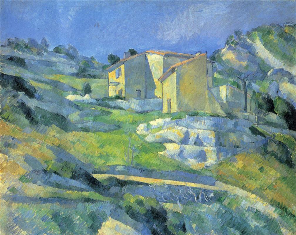
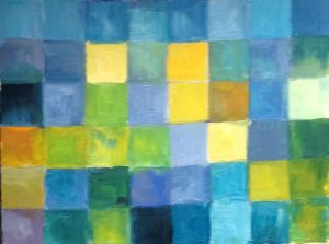
The most obvious feature of this colour harmony is the seeming absence of one of the three primary colours — red. The whole conversation happening here is between blue and yellow (with green as an intermediary).
But is red really absent from this painting?
The best to figure out is to exclude neutral colours (black, grey, “earth colours”) from your palette when doing these colour charts. In fact, it’s better to use only primary colours (two reds, two blues, and two yellows), plus white if you are working with opaque colours (oils or acrylics). This forces you to explore how the less intense, more gray-ish colour areas are composed, since you have to mix these colours from the primaries. In this case, this approach shows how and where red makes its covert appearance within more neutral areas.
It always better to start colour-charting with the most intense, most clear and pure colours, for two reasons. First, they are easier to see and to mix (if any mixing is needed at all). On the other hand, they are less strongly influenced by neighbouring colours: a more neutral can change its appearance completely when you put another, stronger colour next to it.
Your turn
I’ve shown you my examples, but the only way to really feel the effects of this practice is to do it yourself — and the process grows richer and more transformative with each attempt. If you try it, I would love you to write to me about your experience; and, of course, if you have any questions, don’t hesitate to write either.
If you are doing this as a part of your full-scale study of a masterpiece, this exercise comes right after your attempt to colour-chart your inner response to the painting on your own, without looking at the original. Once you complete both practices, it is very instructive to compare the two colour-charts, because it shows you the difference between your “subjective colour” and the master’s, and prepares you for the tensions, difficulties, and discoveries that may lie ahead.