Sonnet 33: Heavenly alchemy

Lena Levin. Sonnet 33: Heavenly Alchemy.

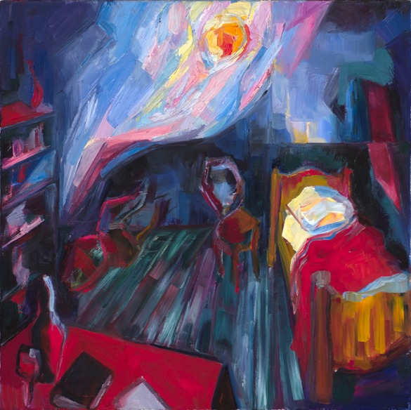
Lena Levin. Sonnet 33: Heavenly Alchemy. 20″x20″. Oil on linen. 2012


William Shakespeare. Sonnet 33

Full many a glorious morning have I seen
Flatter the mountain-tops with sovereign eye,
Kissing with golden face the meadows green,
Gilding pale streams with heavenly alchemy;

Anon permit the basest clouds to ride
With ugly rack on his celestial face,
And from the forlorn world his visage hide,
Stealing unseen to west with this disgrace:

Even so my sun one early morn did shine
With all triumphant splendor on my brow;
But out, alack! he was but one hour mine,
The region cloud hath masked him from me now.

Yet him for this my love no whit disdaineth;
Suns of the world may stain when heaven’s sun staineth.


Adetomiwa Edun reading this sonnet


This sonnet opens a very direct and straightforward way of translation into painting, because it “pretends” to be just a landscape over the first two quatrains. The landscape appears first not as a metaphor, but just as a landscape, albeit described in somewhat heavenly and anthropomorphic language; only in the third quatrain, the metaphor is reversed, so the landscape turns out to be a strategy of dealing with human emotions.

Lena Levin. Tomales Bay: sunrise effects. 18"x24", oil on linen. 2012

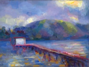
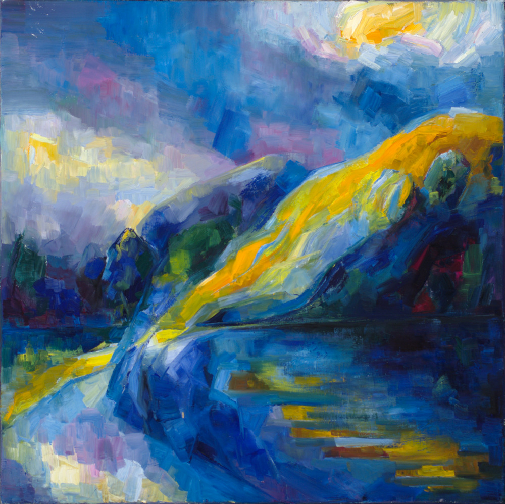
Lena Levin. Tomales Bay: sunrise effects. 18″x24″, oil on linen. 2012

Lena Levin. Alameda: Rain and Sun. 24"x12". Oil on canvas panel. 2011.Lena Levin. Alameda: Rain and Sun. 24"x12". Oil on canvas panel. 2011.

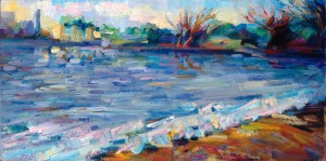
Lena Levin. Alameda: Rain and Sun. 24″x12″. Oil on canvas panel. 2011.

To be more precise, there are two landscapes here, or a single one under different lighting conditions. This ease in combining two or more temporal planes in a poem is often a challenge for a painting translation, but it was easier here: as a plein air painter working in Northern California, I am quite accustomed to painting changing lighting conditions within a single picture frame (and a single plein air session). I include here two paintings from such plein air sessions, which served as the most direct visual anchors for this sonnet painting.

But I knew, from the very beginning, that just a landscape with mixed lighting conditions wouldn’t be enough here. The painting would have to combine a representation of a morning, both sunny and cloudy at the same time, with a decidedly non-representational curvy movement of blues across the painting, a soul in pain of forlorn love.

Working on the landscape itself, I lost the blue curve for a while, and even decided, at one point, that it was a mistaken illusion of my preliminary vision. And yet I couldn’t complete the painting before the “abstract” movement of blues from the bottom of the picture plane towards the sky re-appeared.

Sonnet 29: When in disgrace with fortune and men’s eyes

Lena Levin. Sonnet 29: When in disgrace with fortune and men's eyes.

Lena Levin. Sonnet 29: When in disgrace with fortune and men’s eyes. 20″x20″. Oil on linen. 2012


William Shakespeare. Sonnet 29

When in disgrace with fortune and men’s eyes,
I all alone beweep my outcast state
And trouble deaf heaven with my bootless cries
And look upon myself and curse my fate,

Wishing me like to one more rich in hope,
Featured like him, like him with friends possessed,
Desiring this man’s art and that man’s scope,
With what I most enjoy contented least;

Yet in these thoughts myself almost despising,
Haply I think on thee, and then my state,
Like to the lark at break of day arising
From sullen earth, sings hymns at heaven’s gate;

For thy sweet love remembered such wealth brings
That then I scorn to change my state with kings.


Patrick Stewart reading this sonnet


Vincent van Gogh. Vincent's Bedroom in Arles. 1988.

Vincent van Gogh. Vincent’s Bedroom in Arles. 1988.

The composition of this painting is derived from an amalgamation of two classical images, Vincent Van Gogh’s bedroom in Arles (left) and Marc Chagall’s “The Birthday” (below). There is an obvious similarity in subject matter between two paintings: we see a barely furnished room of a poor man, distinctly in disgrace with fortune and men’s eyes, the room of the artist himself. Apart from the subject matter as such, there is this distinctly claustrophobic geometric grid of the mundane in both of them, and similarly skewed perspectives in how this environment is represented.

Marc Chagall. The Birthday. 1915

Marc Chagall. The Birthday. 1915

There is also, of course, the striking difference created by the presence vs. absence of love: Chagall’s beloved Bella is there in his room, and so he depicts himself like to the lark at break of day arising; Van Gogh’s is a solitary room of an outcast and hermit. In the geometry of Chagall’s composition, love disrupts the angular skewed grid with a graceful curve, which nearly carries the artist to heaven’s gate, out of the picture plane — there are no curves, not even a hint of an upward movement, in Van Gogh’s composition.

This is precisely the contrast that creates the tension of Shakespeare’s sonnet, which breaks the rhythmic grid of the first two quatrains with a slow, graceful upward movement in the third. Except, of course, it’s not an appearance of the beloved that creates this change: the speaker’s imagination, a mere thought of the beloved, is enough. And that’s why I don’t introduce any floating figures in the composition. Instead, the grid of the room is broken by an upward outburst of abstract brushstrokes.

The viewer, however, is invited to float together with the author, insofar as the perspective of the room suggests that it’s viewed from above, by someone whose imagination has just lifted him up from solitary confinement behind the writing desk, alone with his books and his drink.

Sonnet 21: A couplement of proud compare


Lena Levin. Sonnet 21. A couplement of proud compare

Sonnet 21: A couplement of proud compare. 20″x20″. Oil on linen. 2012.


William Shakespeare. Sonnet 21

So is it not with me as with that Muse
Stirred by a painted beauty to his verse,
Who heaven itself for ornament doth use
And every fair with his fair doth rehearse,

Making a couplement of proud compare,
With sun and moon, with earth and sea’s rich gems,
With April’s first-born flowers, and all things rare
That heaven’s air in this huge rondure hems.

O let me, true in love, but truly write,
And then believe me, my love is as fair
As any mother’s child, though not so bright
As those gold candles fixed in heaven’s air:

Let them say more that like of hearsay well;
I will not praise that purpose not to sell.


Tunji Kasim reading this sonnet


This is a sonnet about poetry, and so my painting is about painting.

The sonnet contrasts two kinds of poetry, the true and authentic poetry inspired by love, vs. the false and exaggerated poetry based on hearsay. True to himself, Shakespeare enacts poetry of the latter kind within the sonnet and then “corrects” it; this juxtaposition is highlighted by repetition of rhyme-words and rhyme-sounds of poem-within-poem in the “real” poem (in violation of general rules of Italian sonnet righting [Vendler 1997: 131]). So the overall concept of this translation into painting was rather straightforward: there had to be a contrast between the painting and a painting-within-painting.

Lena Levin. Unbearable strangeness.

Lena Levin. Unbearable strangeness. 12″x12″. Oil on linen panel. 2012

My first approach to this idea involved a juxtaposition of three stylistic versions of approximately the same still-life set up (with a nearly hidden internal reference to a painting of Adriaen Coorte’s. This sketch (now called “Unbearable strangeness) is shown on the left. It didn’t quite work.

To begin with, while concentrating on the contrast between how things are compared by different Muses, I’ve lost the contrast between what they are compared with, essential in the sonnet: the false poetry compares love and beloved with every fair and rare thing on earth and in heaven, the true poetry remains on the earthly level of humanity (any mother’s child). Secondly, I have lost the key (word) of heaven (repeated in every quatrain of the sonnet) as the ultimate standard of comparison, both in the colour harmony and in the (lack of) vertical movement within the “real” areas of the picture plane. It also turned out that repeating the same set-up in a painting-within-painting creates an ambiguity between a painting and a mirror, which doesn’t align with the poem’s meaning.

Therefore, the final painting approaches the same idea in a different way. Most importantly, there is now heaven with gold candles in its air instead of one of still-life versions: it opens up this “chamber” painting into a larger universe and defines both the vertical dimension of the painting and its overall color harmony.

Willem Kalf. Still life with Silver Jug.

Willem Kalf. Still life with silver jug. 73,8 x 65,2 cm. Oil on canvas. 1655-57

Secondly, the subject matter of the “real” still life and of the painting-within-painting is now different: the real one, with bread and onions is decidedly more earthly, the “painted” one, with its lemons, silver and china, more exotic and “fine” (rare and fair). I did, however, retain one common element, the wine glass, for the sake of purely stylistic contrast and to acknowledge the repetition of rhymes in the sonnet.

There is another important difference as well: in the first study above, all three versions of the still life were done from life; here, the painting-within-painting is borrowed from several still life paintings of the Dutch Golden Age (I show here the one most explicitly referred to in my work, by Willem Kalf). This introduces the visual counterpart of “hearsay” in the poem: the rival poets don’t invent their hyperbolic comparisons themselves, but borrow them from others (stirred by a painted beauty).

There are two other, purely visual, contrasts between the two still life areas:

  • Geometrically, the painting-within-painting is a vertical plane (corresponding to “vertical” metaphors condemned in the sonnet), whereas the “real life” set-up is horizontal, earth-bound, almost falling out of the picture plane towards the viewer;
  • Colour-wise, the painting-within-painting borrows its colour harmony from the heaven area and intensifies it as far as possible, that is, heaven itself for ornament doth use. In contrast to this, the real-life area of the painting is saturated with earthly reds and ochres.

All in all, it turned out that a humble still life can offer ample opportunities for creating visual counterparts for a poetic commentary on poetry.


References:
Helen Vendler. The Art of Shakespeare Sonnets. Cambridge, Massachusetts &ndahs; London, England. 1997.

Sonnet 17: Stretched metre of an antique song

Lena Levin. Sonnet 17: Stretched metre of an antique song

Sonnet 17: Stretched metre of an antique song. 20″x20″ (50.8 x 50.8 cm). Oil on linen.


William Shakespeare. Sonnet 17

Who will believe my verse in time to come,
If it were filled with your most high deserts?
Though yet heaven knows it is but as a tomb
Which hides your life, and shows not half your parts.
If I could write the beauty of your eyes,
And in fresh numbers number all your graces,
The age to come would say ‘This poet lies;
Such heavenly touches ne’er touched earthly faces.’
So should my papers, yellowed with their age,
Be scorned, like old men of less truth than tongue,
And your true rights be termed a poet’s rage
And stretched metre of an antique song:

But were some child of yours alive that time,
You should live twice, in it, and in my rhyme.


Diana Quick reading this sonnet.


Domenico Ghirlandaio. Piero di Lorenzo de Medici.

Domenico Ghirlandaio. Piero di Lorenzo de Medici.

For this work, I needed an “antique” painting to stand for the antique song of the sonnet: something not quite believable and somewhat stretched technically, and maybe even yellowed with age.

Since the Early Renaissance would certainly be somewhat “antique” for the future envisioned by Shakespeare, this painting loosely references Domenico Ghirlandaio’s portrait of Piero, the eldest son of Lorenzo de Medici. On the one hand, we don’t quite believe this depiction: the son of Lorenzo the Magnificent had in all probability been somewhat idealized by the artist, albeit for reasons quite different from Shakespeare’s. On the other hand, this portrait has that exact mixture of realism with the stylistic imprint of its time that I needed for a translation of this sonnet: it’s straightforward and somewhat naive colour harmony, elongated face with visible stylistic residues of the Florentine tradition to insert portraits of patrons into religious paintings.

In many ways, these qualities are exaggerated in my work, which adds to the young man’s face more of those heavenly touches we are not supposed to believe. I have wiped away Piero’s arrogance and his (realistic) heavy chin and enlarged the eyes to an unrealistic degree, making them more “in-your-face” beautiful and considerably more romantic and hard to believe.

The right vertical golden rectangle of my square design is supposed to stand for the depiction of the past surviving into the future, with its flatter and smoother colour areas and straightforward contrast of primary colours and black. The left third of the square, where the colours split into a chaotic vertical movement of brushstrokes, stands for the envisioned future with its doubts and scorn. The portrait of the young man, however, doesn’t quite fit into the past, but comes out from the painting-within-painting into the “future”, which allows the future’s split colours and untamed brushstrokes to burst into his perfect hair-do. Is it the future’s scorn? Or repercussions of Shakespeare’s success in his quest to make the young man immortal with his verse? Who knows…