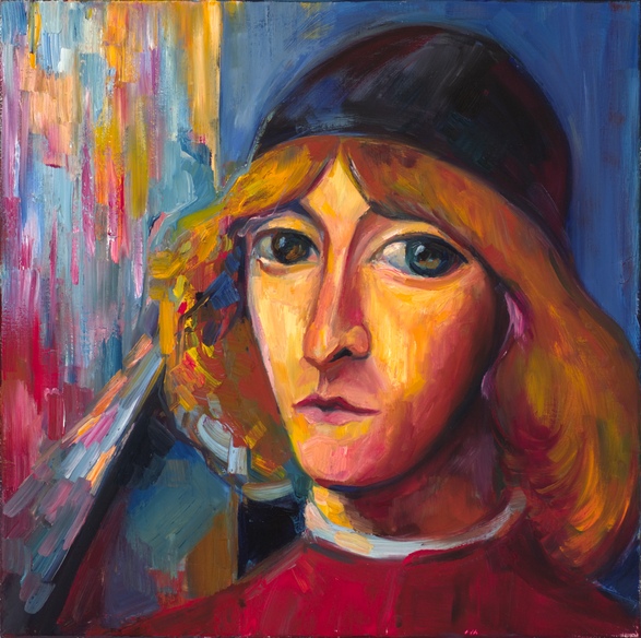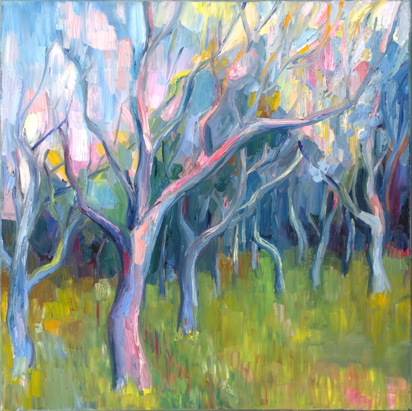
Sonnet 17: Stretched metre of an antique song. 20″x20″ (50.8 x 50.8 cm). Oil on linen.
William Shakespeare. Sonnet 17
Who will believe my verse in time to come,
If it were filled with your most high deserts?
Though yet heaven knows it is but as a tomb
Which hides your life, and shows not half your parts.
If I could write the beauty of your eyes,
And in fresh numbers number all your graces,
The age to come would say ‘This poet lies;
Such heavenly touches ne’er touched earthly faces.’
So should my papers, yellowed with their age,
Be scorned, like old men of less truth than tongue,
And your true rights be termed a poet’s rage
And stretched metre of an antique song:
But were some child of yours alive that time,
You should live twice, in it, and in my rhyme.
Diana Quick reading this sonnet.

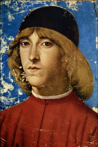
Domenico Ghirlandaio. Piero di Lorenzo de Medici.
For this work, I needed an “antique” painting to stand for the antique song of the sonnet: something not quite believable and somewhat stretched technically, and maybe even yellowed with age.
Since the Early Renaissance would certainly be somewhat “antique” for the future envisioned by Shakespeare, this painting loosely references Domenico Ghirlandaio’s portrait of Piero, the eldest son of Lorenzo de Medici. On the one hand, we don’t quite believe this depiction: the son of Lorenzo the Magnificent had in all probability been somewhat idealized by the artist, albeit for reasons quite different from Shakespeare’s. On the other hand, this portrait has that exact mixture of realism with the stylistic imprint of its time that I needed for a translation of this sonnet: it’s straightforward and somewhat naive colour harmony, elongated face with visible stylistic residues of the Florentine tradition to insert portraits of patrons into religious paintings.
In many ways, these qualities are exaggerated in my work, which adds to the young man’s face more of those heavenly touches we are not supposed to believe. I have wiped away Piero’s arrogance and his (realistic) heavy chin and enlarged the eyes to an unrealistic degree, making them more “in-your-face” beautiful and considerably more romantic and hard to believe.
The right vertical golden rectangle of my square design is supposed to stand for the depiction of the past surviving into the future, with its flatter and smoother colour areas and straightforward contrast of primary colours and black. The left third of the square, where the colours split into a chaotic vertical movement of brushstrokes, stands for the envisioned future with its doubts and scorn. The portrait of the young man, however, doesn’t quite fit into the past, but comes out from the painting-within-painting into the “future”, which allows the future’s split colours and untamed brushstrokes to burst into his perfect hair-do. Is it the future’s scorn? Or repercussions of Shakespeare’s success in his quest to make the young man immortal with his verse? Who knows…
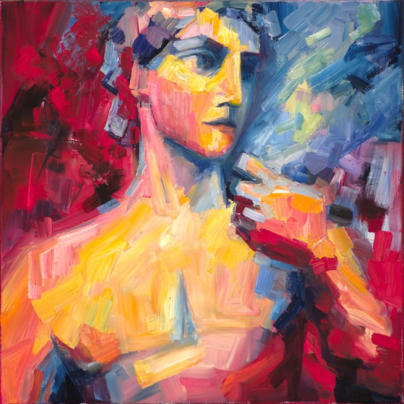
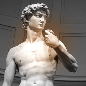 The reference point for this translation is, of course, Michelangelo’s David – the image inevitably suggested by the very concept of “beauty’s pattern to succeeding men”, by the mention of carving, and, last but not least, by the powerful, truly timeless, rhythm of the third quatrain.